Weight: Fingering
Knitting Gauge: 7 - 8 sts = 1" on #1 - 3 needles (2.25mm-3.25mm)
Crochet Gauge: 21 - 23 sc = 4'' on B - E hooks (2.25mm-3.5mm)
Yards: 231
Grams: 50
Put Up: Ball
Care: Hand Wash Cold / Lay Flat to Dry
Palette
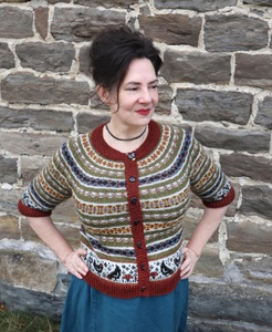
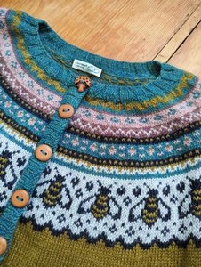
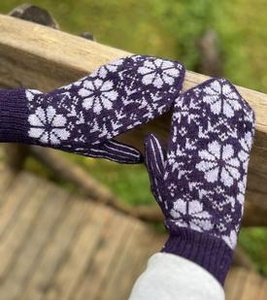
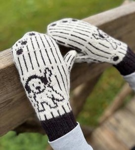
You could call it our practical magnum opus. Palette is Knit Picks™ beloved 100% wool, fingering weight rainbow—expansive, ever-growing, and ever-reliable. Designed especially for Fair Isle and colorwork, Palette features hues that span the entire gradated wheel, including supporting neutrals and a full complement of heathers. Consider Palette for warm and durable socks, slim-fit sweaters, or felted items galore; it'll quickly find a permanent place in your stash and never disappoint.
Get the Color Card or a Mini Pack to plan future color work. Also available as natural undyed yarn so you can create your own colorways.
Akin to looking up into a dark sky in the middle of nowhere, Abyss Heather is deep and complex heather that sets off heather flecks of a bright dark blue against black. You will also notice very subtle heathered flecks of silver throughout, giving Abyss Heather a mysterious yet vibrant finish.
Alfalfa is a cool yellow green color. A delicate foliage green, Alfalfa could be used as a pastel. It is very close to a lime green, but is a softer shade with more yellow tones. It is sure to be a bright spot in your next project.
Almond is a khaki tan color and is lighter than Doe. The shade of creamy nougat, Almond is a good neutral to have in your yarn stash. It is perfect for pairing with a wide range of colors and is great as a focal color too.
Ash is a charcoal gray color. A dark neutral gray, Ash can be combined with a variety of color tones for either a feminine or masculine look. Great for the office or a relaxing weekend at home.
Asphalt is a dark heathered grey color. Much like the asphalt we drive on, it shows color variations throughout the strand giving it depth and natural texture. It could be used in place of black, although it isn’t a true black.
The dark grey of Asphalt Heather is twisted with Bare Palette.
Aster is a medium blue violet color that is lighter than French Lavender and reminds us of spring flowers and bright pastels. It is like looking at a country garden blooming with Asters in their soft and dreamy purple tones. Pair it with Custard, Cosmopolitan, Cotton Candy and other fun colors.
Aurora Heather is a deep emerald heather, with hints of bright Kelly green and a green that's so dark it's almost black. The depth of color provided by the heathered blend of different shades of green gives Aurora a rich and luxurious look to any project.
Autumn is a rusty reddish brown color. True to the red and golden tones found in fall leaves, Autumn's heathered look will add depth and interest to your next fall project.
Bark is a medium chocolate brown color. It’s as tantalizing as your favorite candy bar, yet the perfect neutral to add to your wardrobe or yarn stash for future projects. It is the perfect focal yarn or looks great as an accent color when combined with lighter yarn colors like Cornmeal, Suede and Cream.
Bison is a rich bittersweet chocolate brown color that has less red than hazelnut. Like a worn leather jacket, Bison is a cozy and welcoming color that you will want to wrap yourself in. It’s great for pairing with other neutrals as well as oranges, yellows and greens for a beautiful fall combination.
Bittersweet is a dark chocolate color. Much like the rich bittersweet chocolate it is named after this luscious deep brown is a staple in your yarn stash. It’s perfect for use as a focal color or in color work. Pair it with lighter browns or with oranges and greens for a festive fall project.
Black is a true black and looks great with anything. Use it as an accent color in your favorite pattern or by itself.
Blossom is a delicate pink color, darker than Blush. A heathered yarn, Blossom features light to medium shades of a soft baby pink color palette. Not only does it remind us of beautiful pink spring flowers, but a little like cotton candy too.
Blue is a true medium blue. It is the perfect shade of blue that compliments a range of colors from neutrals to pastels. Slightly deeper in tone than an ocean blue, it is a must to have in your yarn stash.
Bluebell is an icy blue violet color. A soft pastel blue, Bluebell is lighter and has less blue than Chicory. It makes us long for the fresh spring blooms of the Bluebell flowers it is named after. This delicate color looks great when paired with dark violets, blues and other pastels.
Blue Note is a medium sapphire blue color with a purple undertone. A rich heathered color, Blue Note captivates the eye with a beautiful variation of colors from a reddish pink and turquoise blue to a medium blue violet mixed throughout the strands for the overall sapphire color.
Blush is a delicate, soft pink color with a slight bluish undertone. A light pink, it is a delightful color that looks beautiful when paired with other pastels as well as darker colors.
Bouquet is just that, a bouquet of color. A heathered color, Bouquet shines with hints of a golden yellow, pinks and violets for a beautiful color combination. The overall look gives off a dusty plum with pink undertones color.
Brass is a heathered golden brown color. The mottled strands feature reds and yellow tones that combine and give an overall brassy combination. It is perfect for fall and pairs beautifully with browns.
Briar Heather is a richly heathered brown. Along with warm undertones and subtle flecks of cream against a range of browns, Briar Heather falls somewhere in between Doe and Bark and is perfect for adding a soft transition of color when working with other neutrals.
The rich heathered brown of Briar Heather is twisted with Bare Palette.
Brindle is a warm chestnut brown that features red and orange tints. Close to a reddish brown, Brindle pops with excitement when paired with browns, greens, yellows and oranges like Turmeric, Masala, Bark, Cornmeal, Verdant and even Ivy.
Brown Sugar is a very rich tawny brown with warm red undertones. Having subtle hints of sienna and burnt umber, Brown Sugar is a versatile colorway that lies somewhere in between a very warm medium brown and an earthy rust red.
Calypso is a vibrant turquoise blue color. Blue green in tone, Calypso reminds us of the sparkling blue and green colors that can be seen in the deepest parts of the ocean. It’s a lively color that will brighten up any wardrobe and looks great when used in color work.
Camel is a medium khaki color. A warm neutral, Camel is the perfect go to shade that looks great with any color. Perfect for pairing with dress pants or jeans; making it an essential color for your wardrobe.
The medium khaki color of Camel Heather is twisted with Bare Palette.
A bright, vibrant, sunny yellow. Canary will remind you of sunflowers and school buses. This is not a "mellow yellow" but instead a shade that will instantly lift your spirits and put a smile on your face.
Caper is a lighter green with very warm undertones of olive and browns, and would work well with other neutrals and shades with warmer hues.
Caribbean is a bright blue green color. Along the lines of a teal, it will whisk you away to being on vacation. A great color to use for fall and winter for a spice of color and relaxation.
Cayenne is a hot color that is bright, bold, and sure to make a statement! This fiery orange has undertones of red and works well for vibrant, colorful projects or tone it down by using it as a fun accent shade in your next colorwork project.
Celadon is a pale jade green color. A delicate heathered color, Celadon ranges from a soft yellow to a celery green for a light and beautiful combination.
Celestial is a vibrant royal blue color that is brighter than Jay. Its electric color tone reminds us of a night sky that shines with glistening stars and the radiant glow of the moon. A beautiful medium blue that goes great with a variety of color choices.
Chicory is a cornflower blue color. A radiant medium blue with lavender undertonesit features more blue and is darker than Bluebell. It works great as a focal color and shines when paired with other colors like pink, lavender, neutrals and blues.
Ciel is a stormy medium blue with muted grey undertones. With subtle hints of steel blue and an understated cornflower, Ciel is a lovely blue that is that soft and refined. Use this with other muted colors like Ice Lily, Sea Grass or Gosling for a soft color palette or use it in a gradient of dramatic blues.
Clarity is a very light powder blue color with an ever so subtle hint of green. This versatile color is light enough to stand as an accent color to add a bit of contrast against a variety of colors.
Clematis is a red violet color. The heathered strands feature a golden yellow and medium blue to a pinkish red giving the overall look of a medium plum tone. An intriguing color, Clematis shines with texture due to the mottled nature of the yarn.
Clove Heather is an interesting mix of burnt orange with hints of sienna and a rich, warm dark green.
Clover is a rich avocado green color. A yellow green, Clover resembles lush patches of greenery that shine in the sunlight all year long. Pair it with Turmeric, Masala and Sweet Potato for a beautiful fall color scheme.
Comfrey is a muted lavender with warm undertones that has an understated elegance to it. In addition to hints of dusty plum and stormy wisteria, Comfrey a lovely color that pairs well with other muted colors and soft pastels.
Conch is a light pinkish orange color and has less red than Rose Hip. Much like the beautiful coral colors found on the inside spiral of a conch shell; it is a vibrant shade that will make your color work shine.
Coriander Heather is a blend of warm camel tones blended with a light tan and beige, making it an ideal neutral with depth.
Cornmeal is a light yellow color with gray undertones. It is very similar to a golden straw color and looks beautiful when used in color work. A fabulous match with browns, oranges, greens and blues.
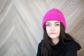
Cosmopolitan is a very bright fuchsia pink color. It is brighter and has less purple than Fuchsia and shines with almost a neon glow and will make your color work pop! Along the lines of the pink you find in a Cosmos flower, Cosmopolitan is sure to brighten up any wardrobe.
Cotton Candy is a rosy pink color. A soft pink with a grey undertone, Cotton Candy is a medium pink that is deeper than a soft baby pink. It pairs up beautifully with other pastels and neutrals.
Cream is a delicate off white color with a pink undertone. This neutral is ideal for combining with bright spring colors or deep colors for a richer look. A versatile color for any project or occasion.
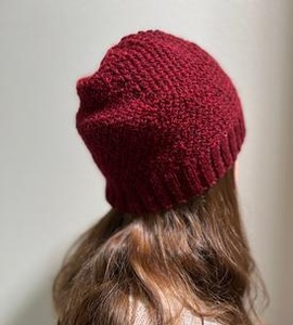
Currant is a deep red violet color with brown undertones, darker in tone than Pimento. It is very close to a maroon or dark burgundy, Currant is a rich jewel tone color that you won’t be able to resist.
Custard is a creamy light yellow color. This soft pastel is softer and has more yellow than Cornmeal and is as tantalizing as the dessert it is named after. It is also very similar in color to lemon chiffon. It pairs up beautifully with browns, blues, oranges and purples.
Cyan is the perfect combination of blue and green. It is brighter and has more blue than Whirlpool. A true cyan color, it is bright and cheery, and could also be called an aqua blue.
Delta is a dark blue with a slight green undertone. A deep heavy blue, Delta is darker than Blue but lighter than Marine Heather. It also resembles a medium blueberry color as well as the rich blues found at the mouth of rivers. A classic color that will work in any wardrobe.
Doe is a light chocolate brown color. A great neutral to keep in your yarn stash, this toasty brown will warm up any project. It looks fabulous when paired with other browns as well as with orange and yellow tones for a dreamy fall design.
Douglas Fir is a deep blue green color with a grey undertone. It features more blue than a hunter green, but has more green than a mallard green. A luscious jewel tone, Douglas Fir pairs beautifully with other jewel tones, and can be used for both masculine and feminine projects.
Edamame is a light avocado color. A spring green, Edamame is a medium yellow green that pops when paired with yellows, greens and oranges for either a fresh spring look or a crisp fall inspired sweater.
Eggplant is a medium, royal purple color. This blue violet shade reminds us of a juicy batch of fresh purple grapes as well as the rich purple tones of the vegetable it is named after. It pairs up beautifully with Hyacinth, Lipstick, and Blush.
Fairy Tale is a regal magenta purple, a transitional hue that can make the gradient of your dreams come true. More pink than Mulberry, and more purple than Currant, this versatile color can work among purples, pinks, and reds equally well, for an enchanted palette that will have your projects living happily ever after.
Finnley Heather is a complex mix of heathered greys that range from cream to a medium ash and taupe grey, along with subtle hints of a darker charcoal grey. Pairing together a warmer cream with a range of greys makes Finnley Heather the ideal, shade-shifting grey that works with a range of colors.
Forest is a medium misty yellow green color whose overall shade is lighter and includes more yellow than Ivy. Like the many shades of green found in the forest, it combines strands of yellow and a variety of greens for its beautiful heathered look.
French Lavender is an elegant blue violet color. A creamy purple, French Lavender is darker than Aster and matches the lavender tones of the blooms it is named after. It also has an appearance that is close to a light grape juice.
Fuchsia is a bright pinkish purple color. An electric magenta, it is named after the beautiful and vibrant flowers of the fuchsia plant. More pink than Fairy Tale, but is darker than Cosmopolitan, it shines when combined with other pinks, purples and blues and is perfect for use in color work.
Garnet is a dark red color. Close in color to pomegranate seeds, Garnet is a rich jewel tone that will stand out for work or play. Pair it with Ivy for a beautiful holiday color scheme or with Navy for a little patriotic flare.
Golden is a soft yellow orange color. The mottled tones give this light tangerine color a warm golden glow. It complements other colors very will including Navy, Green Tea, Bark and Ivy.
Gosling is a medium grey with a barely there hint of green undertones. This delicate color works excellently as a subtle transition color for complex colorwork projects and fares just as well on its own for those who love to work with muted color palettes.
Grass is a vibrant, medium green that is close to a true green, but has a touch of yellow. It has the same tonal value as Teal, but features more yellow than blue. Similar to the color of summer grass and fresh green foliage, Grass is a wonderful color that complements yellow greens as well as darker shades of browns and blues.
Green Tea Heather is a soft, muted light green with subtle warm undertones. Green Tea Heather work well with warm browns or try bright shades of blue to brighten things up with pop of contrast.
A cool medium brown, Grizzly Heather has more of a gray undertone than Bark, Brindle Heather and Bison. A perfect neutral to pair with other cool toned bright colors, like icy blues. Or create a color gradient of cool browns, by combining Grizzly Heather with Bittersweet Heather and Thicket.
The cool medium brown of Grizzly Heather is twisted with Bare Palette.
Hare Heather is a wonderfully complex neutral that ranges in shades from a very light cream to beige, camel, and a dusty light brown. With slightly cooler undertones, Hare Heather is an excellent neutral on its own or as part of a soft gradient of creams, browns, and greys.
Haze Heather is a foggy shade of lavender with a gray undertone. If you look closely, you will see that we have blended rose pink, navy blue, and white together to create this heathered shade. Haze Heather is a complex color that could be seen as more neutral or pastel, depending on the colors that you pair with it. This shade is versatile enough to match with lots of different garments in your wardrobe.
Hazelnut is a dark reddish brown color. A russet brown, Hazelnut has more red than Bison and has us dreaming of freshly brewed hazelnut flavored latte’s that are very popular here in the Northwest. A beautiful color that would look great in a fall sweater or vest.
Hollyberry is a rich berry red color. A close resemblance to burgundy, Hollyberry is a jewel tone that looks fabulous when combined with dark colors or with lighter shades.
Huckleberry is a misty red violet color. The range of light to medium purple tones; make it sparkle like the sun shining on a luscious plum in the summer. It looks great when paired with other purples like Eggplant and Hyacinth.
Hyacinth is a soft violet color with a slight reddish undertone. This delicate color easily resembles the shade of blooming lilacs and hyacinths in your spring garden. It knits up beautifully for a gentle feminine themed project. It is perfect for use in color work with a darker focal color or with other pastels.
Soft and understated, Ice Lily is an elegant shade of light lavender with warm, muted undertones. Similar to wisteria with warm tones throughout, Ice Lily is lighter than Seraphim with stronger shades of pink.
Indigo is an inviting combination of blues and purples that give you the overall indigo blue tone. Pair it with purples and violets to play up the purple values or with dark blues to bring out more of the blue tones.
Iris is a light, misty blue violet color with a slight grayish undertone. A soft heathered color, Iris incorporates a variety of color tones from delicate whites, blues and reds for the overall mottled color, much like a variegated Iris petal.
Ivy is a deep, lush blue green color. Almost a dark evergreen, Ivy reminds us of walking through the rich grassy areas of a thick forest here in the Northwest.
Jay is a deep midnight blue color, but isn’t as dark as Navy. It’s similar to the dark blue shades of a Blue Jay’s feathers, which will give your next project the look of classic denim.
Kumquat is a yellow orange color. It’s a tantalizing citrus orange with heathered strands ranging from a golden yellow to a medium orange. A vibrant color that will spice up your fall and winter wardrobe.
Lady Slipper is a delicate pinkish purple color. It has more purple than Blush, but has more pink and is brighter than Hyacinth. This delicate pastel reminds us of the purple and violet tones found in the beautiful blooms of the orchid. Combine with other pastel colors for a light and sophisticated project.
Lantana is a dusty red violet color and is darker than Hyacinth. A light shade of plum it looks exquisite when paired with other red violets, pinks and some blues.
Larch Heather is a rich, deep green color with warm, heathered flecks of olive and brown undertones for added depth of color.
Lichen is a lush, mossy green colorway with soft hints of olive and yellow. The warm undertones allow Lichen to go with other warm neutrals but it also shines when paired with bright and vibrant blues.
Limeade is a bright, vibrant, and almost neon shade of lime green. This shade is heathered, so there are tiny bits of aqua and chartreuse blended into this color. Combine with Whirlpool or Sky.
Lingonberry Heather is a deep, dark red with strong cool undertones. With heathered flecks ranging from bright red to carmine, and wine. The heathered flecks of deep purple can almost look like speckled of black throughout to add a sense depth to this color that makes it really shine!
Lipstick is a pinkish burgundy wine color. A darker shade of magenta, Lipstick is a rosy color with blue undertones that add richness and depth to this striking color. It takes on a reddish look when paired with Navy and takes on a more pinkish violet color when paired with Eggplant.
Lynx Heather is a medium brown that that is set against heathered flecks of toasty warm browns with red undertones and lighter beige. The addition of subtle heathered flecks of silver give Lynx Heather a luminescent quality to its color. A wonderful color on its own, you'll love Lynx Heather for creating subtle gradients and transitions of browns and neutrals.
True to its name, Macaw captures the vibrant shades of green found in these bright and colorful birds. Macaw is a true bright green with slightly cooler undertones that works well alone or as a bright accent color to make your project pop.
MaiTai is a soft dreamy orange yellow color. It is lighter and has less pink than conch. This delicate heathered yarn looks a lot like a orange creamsicle that has been swirled together for a delicate mottled look. Perfect for pairing with oranges, yellows and browns.
Majestic is a regal purple with blue undertones and is darker than French Lavender. It’s as tantalizing as a cool glass of grape juice, and is sure to be a bold addition to color work. Pair with deep blues to bring out the blue tones and with other shades of purple to play up the purple tones.
Marble is a cool blue gray color. Just like a true marble has variations of light and dark tones, our heathered Marble yarn does too. This beautiful neutral grey is ideal for either masculine or feminine projects and goes with a wide range of colors for extreme versatility.
The cool blue grey of Marble Heather is twisted with Bare Palette.
Marina is a vibrant blue green color. A bold teal, Marina, will remind you of the deep, glistening blue green waters of the ocean. It is a fun way to brighten up any winter project.
Marine is a dark blue green color. It makes us long for a relaxing day at the beach or at the marina watching the deep blue and green waves lap at the shoreline. A jewel tone itself, it looks great when paired with other jewel tones.
Masala is a rusty, brownish orange color. Like the combination of South Asian spices it is named after, Masala will give your wardrobe a warm and spicy touch. A rich color that is perfect for your next fall project. It looks fabulous when combined with Clover, Bark, Ivy and Cornmeal.
Mauve is a dusty, pinkish purple color with grey blue undertones. It has more blue tones than a true magenta, which tones it down for a mixed berry color.
Merlot is a deep reddish brown color. It is very close in color to a raisin or currant. The heathered tones range from; light golden yellows to a dark raspberry red giving the overall color the look of a luscious chocolate raspberry look.
Midnight Heather is an intense dark blue color with black undertones. Reminiscent of the dark night sky, Midnight Heather intrigues us with the flecks of blues and blue greens that add visual interest to this usually rich color.
Mineral Heather is a bluish grey color that is created using a variety of shades including blue, red, and a light violet to give the overall mottled look. This heathered yarn is beautiful and has great depth as a stand alone color.
Mist is a cool, icy gray color with a slight blue undertone. Like the light early morning mist that sparkles in the sunlight, it will shine as well as add a delicate touch to your next project. It looks great when paired with darker shades of gray as well as with blues to play up the blue tones.
Mongoose is a creamy medium brown. Not as light as a milk chocolate, but resembles the color of espresso. A rich color that looks great with darker brown, oranges, and greens for a classic fall combination.
Mulberry is a dusty plum color. A medium purple, Mulberry is lighter and has less purple than Eggplant. A regal jewel tone, it is perfect for use as a focal color or in color work.
Navy is a deep, dark blue color. One of the darkest shades of blue, Navy can be mistaken for black at a quick glance. This rich color will add a classic color scheme to your wardrobe whether you wear it for a relaxing weekend at home or in the office.
Opal Heather is a dusty turquoise, a light blue-green with a gray undertone. Look closely, and you will see subtle bits of rose pink and lemon yellow peeking out from the yarn. Despite being such a colorful mix, this yarn is actually quite subtle. Like an impressionist painting, you don?t notice all of the colors until you examine Opal Heather closely. This yarn would be a beautiful main color for a Fair Isle yoke sweater, and you could highlight all of the heathered colors in the colorful yoke.
Orange is a true orange color that is brighter than Sweet Potato. It is the ideal orange that looks perfect with browns, greens and reds for that perfect fall sweater.
Oregon Coast is a sandy brown color. The multi-colored flecks throughout the strand give a beautiful heathered look reminding us of the colors of the shells and rocks that make up our exquisite beaches along the Oregon Coast line.
Oyster is a creamy off white color that is darker than Cream. It is very similar to a light mocha with its light beige tone. A soft neutral, Oyster is perfect for use with a wide range of colors.
Peapod is the color of fresh cut grass, sprouting seeds, and leafy shade trees. This happy shade will remind you of springtime blooms. Peapod is a light green, but not as yellow based as lime or chartreuse green, so it will compliment many different skin tones.
Pennyroyal is a soft, dusty lilac color. With just a hint of purple, it is a delicate color that you will love to use with other deeper purples or pastel combinations.
Peony is a warm pink color with an orange undertone. Named for the beautiful pink peony, its slight rose colored tone looks exquisite when paired with pastels and neutrals. A fabulous color choice for your next spring or summer project.
Pimento is a deep, rich red color. Named after the Cherry Pepper, Pimento is similar to a bold Tuscan red tone that is warm and earthy and looks great as the focal color or used in color work.
Mmm. This yarn is the color of a double scoop of pistachio gelato. Pistachio is a mint green yarn that lets you create ice cream inspired combinations, pair with Bark for mint chocolate chip, or combine with Bison and Cotton Candy for spumoni.
Pool is a creamy, cool sapphire blue color. With a hint of a violet undertone, Pool resembles the shade of a medium sky blue that intrigues our eyes every sunny spring day. It is perfect for a spring or winter sweater.
Puma Heather is a lovely heathered light brown with muted undertones and flecks of raw umber, sand, and subtle hints of silver. Lighter than Lynx Heather yet cooler in tone than Wheat Heather, Puma Heather is the perfect brown that lets you transition in between a variety of browns, greys, and other neutrals.
Pumice Heather looks like a muted neutral brown but upon closer inspection, flecks of cream, grey, and light umber brown combine for a complex color that will look warmer or cooler depending on what it is paired with.
The muted neutral brown of Pumice Heather is twisted with Bare Palette.
Rainforest is a rich deep antique teal color. This beautiful heathered yarn has a mottled look with varying shades of blue greens and touches or red violets that give added depth and texture to this exquisite color.
Raspberry is a pinkish orange color. A deep salmon color, Raspberry is a bold and bright addition to your yarn stash. It shines when paired with Navy, Eggplant and Blue Note.
Regal is a rich red violet. It is the shade of a glass of red wine, or blackberry jam. If you are creating a color gradient, Regal fits in between Currant and Fairy Tale.
Rooibos Heather is a spicy blend of toasty oranges and reds with warm flecks of rich, dark browns mixed throughout.
Rose Hip is a vibrant pinkish red color with a slight orange undertone. With more red than Conch, it is like a warm and electric salmon pink. Rose Hip is ideal for making a bold statement in your next knitting project.
Rouge is a glowing reddish pink color. With more red than Blush, it is like warm flushed cheeks, Rouge is a vivid pink that shines with almost a neon intensity. A dark bubblegum pink tone, it is sure to make your color work stand out.
Safflower is a sunny yellow orange color with a brownish undertone. A medium yellow tone, Safflower’s golden tones give it a slightly aged look. It has more orange than Custard, but less than Semolina.
Sagebrush is a delicate seafoam color, somewhere in between a soft blue and green. This soft color was warm, grey undertones which makes it pair with cooler and warmer tones.
Salsa is a reddish orange color with flecks of golden yellow. This spicy color reminds us of a bowl of homemade salsa with all of its warm and inviting red and orange tones. A rich color that looks fabulous when combined with browns, greens and other orange shades.
Seafaring is a stormy blue-green that is reminiscent of the shifting colors of the deep seas. With hints of teal and pine green, Seafaring is a dramatic color that can easily navigate the seas between greens and blues.
Sea Grass is a warm light green with strong grey undertones. Sea Grass is a color that can also read as a muted pastel and works well as a transition color that pairs well with other soft neutrals as well as darker shades with similar muted tones.
Semolina is a golden yellow color with a slight hint of a brown undertone. Very similar in color to a beautiful spring daffodil, Semolina is a great way to brighten up your spring or summer knitting. It looks fabulous when paired with Navy, Masala, and Bark.
Seraphim is a dusty mauve color with a grey undertone. An icy, pale lavender color, Seraphim shines when paired with deeper lavender colors like Currant.
Serpentine is a caramel brown color with a yellow undertone. The golden tones give it the look of an antiqued bronze for a touch of vintage appeal.
Serrano is a fiery red color. Named after the Serrano Pepper, it is brighter than Pimento and has more red than Lipstick. It is sure to spice up your knitting projects. It pairs up beautifully with blues and neutrals as a focal or accent color.
Shire Heather is a cool and complex color that blends dark brown with heathered flecks of blues, teals, and mossy greens. This makes Shire Heather a very versatile color, allowing it to pick up hints of other colors that it is paired with. It would also work extremely well as a transition color from browns to blues or greens.
Shoal is a deep and mysterious color that is similar to a very dark pine green with subtle hints of midnight blue. Shoal is a complex color that manages to be vibrant while being a fairly dark color that can easily shift from blue to green depending on what it is paired with.
Silver is a slate gray color. An elegant neutral grey, Silver is lighter than Ash but darker than Mist. It is a must to keep in your yarn stash. It is the perfect shade that will go with every color.
Sky is a light blue color. Close in color to a baby blue or to a clear blue spring sky, it shines when paired with other pastels and darker shades of blue.
Spearmint is a pine green color. The slight bluish grey undertone gives it a soft mistier look that has an almost vintage vibe. It pairs up beautifully with Navy, Ivy, Bark, Masala and Sweet Potato.
Spruce is a deep teal color that is named for the deep blue and green tones of a Spruce tree. This rich jewel tone will add a touch of elegance to your next project. It looks great when paired with other jewel tones as well as with pastels like Blush for a softer, more feminine look.
Stellar Heather is a dark heather that sets flecks of crimson, wine, and reds against black while the subtle flecks of white give a depth and texture to this complex color. Perfect for transitioning from blacks into other warmer shades, Stellar Heather is also a wonderful warm black on its own.
Suede is a soft caramel brown color. Just like a suede jacket wraps you in warmth and comfort, this creamy brown will indulge your senses while knitting your next project. It looks rich and dreamy when paired with Bark and Masala.
Sweet Potato is a spicy orange yellow color. It is close in shade and tone to the flesh of a sweet potato and is very similar in color to the skin of a pumpkin with a rusty brown undertone. A beautiful color for that perfect fall sweater!
Tarragon is a yellow green color with grey undertones. An antique green, it looks fabulous when paired with browns and oranges for a fun fall combination. Great for color work or as a focal color.
Teal is a dark blue green color. A deep leafy green, Teal reminds us of the great outdoors, and is also close in tone to a mallard green. It’s a rich, lavish color that is appropriate for either masculine or feminine projects.
Soft and sophisticated, Tea Rose is a dusty rose color with muted undertones. A color with timeless elegance, Tea Rose has warm undertones with subtle hints of puce. Works well as a transition color or create an entire palette of soft, muted tones with similar tones like Ice lily, Sea Grass, Comfrey, Gosling or Ciel.
Thicket is a dusty light brown with a gray undertone. Create an earth toned project by pairing taupe Thicket with a forest green, like Forest Heather and Verdant Heather.
Tidepool is a misty blue green color that is close to a medium teal. The mottled heather look comes from shades of blue, green and yellow intermixed throughout the strand similar to a fresh water tidepool that glistens in the sun.
Toffee is a wonderfully warm medium-brown that almost seems to glow with subtle hints of bronze and copper. Similar to Brown Sugar, Toffee is lighter in shade with stronger undertones of yellow throughout and would pair well with other jewel tones.
Just like a fresh homegrown tomato at the peak of its season, Tomato is a color that captures this warm and vibrant shade. With rich, warm undertones of yellow and orange, Tomato is a versatile color that works well with other vibrant colors or can be combined with darker, richer shades of brown and grey for a more masculine appeal.
Tranquil is a calming blue green color. If you find the calming turquoise colors of the ocean soothing and enjoyable, then you will love having a sweater knitted out of Tranquil. It's a beautiful color on its own or for color work.
Turmeric is a brownish, orange yellow color. Inspired by the golden tones of spices found in South Asia, Turmeric will become a favorite color to use in your fall wardrobe.
Urchin is a pleasantly plum shade of purple! Not too bright and not too dark, Urchin lies in between a muted violet-purple and a grape purple. Elegant on its own, Urchin also pairs well with other jewel tones to create a color combination that pops.
Verdant is a mossy green color. The heathered strands range in colors from a turquoise blue, and olive green to a golden brown. Combined they make a beautiful, lush vintage or rustic green.
Victorian is a deeper and more vibrant shade of dusty rose with warm muted undertones. This elegant shade is sure to round out your next color palette, whether you are working with soft pastels or a transitional section of muted pinks, reds, and purples.
Wallaby is a medium brown-grey with golden undertones, similar to a darker shade of taupe. A mid-tone, it can appear as a warm grey when paired with cooler tones, such as greys, or as a cool brown when paired with warmer tones, such as browns.
Wheat Heather is a toasty warm beige with hints of camel, raw umber, and light heathered flecks of a barely there ercu. Wheat Heather is a lovely neutral that is in between the colors of Almond and Doe.
Whirlpool is a medium blue green color that is very close to a light teal. A medium turquoise, Whirlpool is darker than Sky and is the perfect combination of blue and green just like the eye-catching whirlpools found in the oceans and rivers.
White is a light creamy white color. A true neutral it will go with any color palette as an accent or focal color.
Wonderland is a delicate light blue color. It has more green than a traditional baby blue giving it a slight teal undertone. The heathered strands range from an almost white to a medium ice blue.


